Images and graphics are the secret weapon of digital content—they grab attention, simplify complex ideas, and give your brand a memorable personality. But simply “adding more pictures” isn’t the answer. The key is to design visuals with purpose. This article shares 10 practical ideas, along with tips on file specs and layout, to make your e-book both appealing and reader-friendly.
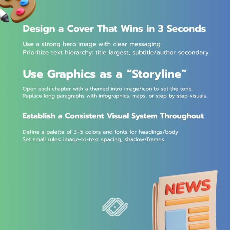
1) Design a Cover That Wins in 3 Seconds
- Use a strong hero image with clear messaging and enough negative space.
- Prioritize text hierarchy: title largest, subtitle/author secondary.
- Apply high-contrast colors so the cover stands out even as a small thumbnail.
- Suggested specs: Vertical ratio 1:1.6–1:1.5 (g., 1600×2560 px), sRGB, save as JPG (quality 80–85) or PNG for transparent/sharp graphics.
2) Use Graphics as a “Storyline” (Visual Narrative)
- Open each chapter with a themed intro image/icon to set the tone.
- Replace long paragraphs with timelines, infographics, maps, or step-by-step visuals.
- Avoid generic stock images—add details that reflect your audience’s context.
3) Establish a Consistent Visual System Throughout
- Define a palette of 3–5 colors, fonts for headings/body, and a recurring set of shapes/icons.
- Set small rules: image-to-text spacing, shadow/frames, corner radius, etc.
- Create 2–3 master page templates and alternate them to add rhythm.
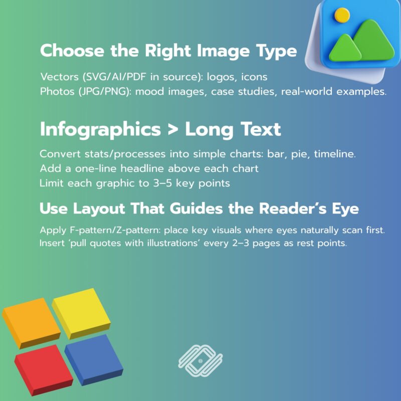
4) Choose the Right Image Type: Photos, Vectors, or Screenshots
- Vectors (SVG/AI/PDF in source): logos, icons, diagrams—sharp at any size.
- Photos (JPG/PNG): mood images, case studies, real-world examples.
- Screenshots: software demos or step-by-step guides—highlight key areas with boxes/arrows.
- Tip: For photos, ~1500–2400 px on the long edge is sufficient; compress moderately to balance clarity and file size.
5) Infographics > Long Text
- Convert stats/processes into simple charts: bar, pie, timeline, step diagram.
- Add a one-line headline above each chart so the key message is clear at a glance.
- Limit each graphic to 3–5 key points for faster cognitive processing.
6) Use Layout That Guides the Reader’s Eye
- Apply F-pattern/Z-pattern: place key visuals where eyes naturally scan first.
- Insert ‘pull quotes with illustrations’ every 2–3 pages as rest points.
- Don’t let text run too close to images—keep consistent spacing and add short captions.
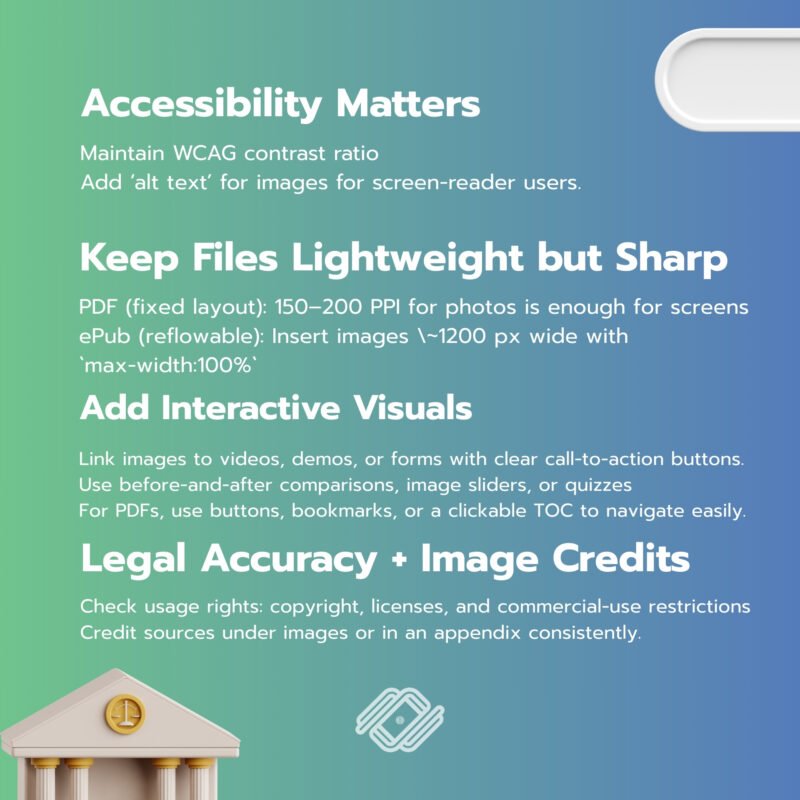
7) Accessibility Matters
- Maintain WCAG contrast ratio (~5:1 for normal text).
- Add ‘alt text’ for images (in reflowable/ePub) for screen-reader users.
- Avoid embedding long passages of text inside images—keep it selectable and searchable.
8) Keep Files Lightweight but Sharp
- PDF (fixed layout): 150–200 PPI for photos is enough for screens; use JPG (medium quality) and PNG only for flat graphics/transparent backgrounds.
- ePub (reflowable): Insert images ~1200 px wide with `max-width:100%` for responsiveness.
- Use vectors for icons/lines to reduce size and keep sharpness.
9) Add Interactive Visuals (If Platform Supports)
- Link images to videos, demos, or forms with clear call-to-action buttons.
- Use before-and-after comparisons, image sliders, or quizzes (ePub3/interactive readers).
- For PDFs, use buttons, bookmarks, or a clickable TOC to navigate easily.
10) Legal Accuracy + Image Credits
- Check usage rights: copyright, licenses, and commercial-use restrictions.
- Credit sources under images or in an appendix consistently.
- For commissioned visuals, set clear license agreements to avoid issues later.
Suggested Workflow
- Draft content outline → 2) Define visual style (colors/fonts/icons) → 3) Create 2–3 page templates →
- Prepare visuals (cover, infographics, illustrations) → 5) Assemble content → 6) Check accessibility/links → 7) Compress/test across devices.
Quick Tech Specs (Cheat Sheet)
- Color: sRGB for digital.
- Fonts: Headings 28–36 pt, body 12–14 pt (depending on layout/device).
- Spacing: Line height 3–1.6, page margins at least 16–24 px.
- Formats:
– PDF (Fixed-layout): precise design control, great for portfolios/direct sales.
– ePub (Reflowable): flexible, ideal for stores and varied devices.
- Tools: Figma/Canva for graphics, InDesign/Affinity Publisher for layouts, Sigil/Calibre for ePub.
Pre-Publish Checklist
[ ] Cover looks clear even as a small thumbnail. [ ] Every infographic has a one-line summary headline. [ ] Contrast meets accessibility + alt text provided (if ePub). [ ] All links work properly. [ ] File size optimized (fast load, sharp display). [ ] Image credits/licenses included. [ ] Tested across phone/tablet/desktop and multiple reader apps.
If you want your business to reach online customers and achieve sustainable marketing results, we are happy to provide consultation on what you need.
For further inquiries, contact us at:
Tel. 093 696 4498 Line OA: https://lin.ee/po8XduU
E-mail: mongkontep@pkindev.com
Inverze Solutions Co., Ltd. has received numerous awards for its achievements