When it comes to web design, creating a functional layout and writing engaging content is only part of the story. Colors and fonts play a powerful role in shaping user emotions, building brand recognition, and attracting your target audience. This article explores how to choose and combine colors and fonts effectively to enhance your website’s appeal.
The Importance of Colors in Web Design
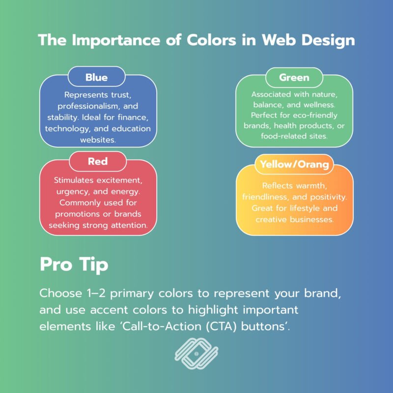
Colors are more than just decoration — they influence mood, perception, and decision-making.
- Blue: Represents trust, professionalism, and stability. Ideal for finance, technology, and education websites.
- Green: Associated with nature, balance, and wellness. Perfect for eco-friendly brands, health products, or food-related sites.
- Red: Stimulates excitement, urgency, and energy. Commonly used for promotions or brands seeking strong attention.
- Yellow/Orange: Reflects warmth, friendliness, and positivity. Great for lifestyle and creative businesses.
Pro Tip: Choose 1–2 primary colors to represent your brand, and use accent colors to highlight important elements like ‘Call-to-Action (CTA) buttons’.
Choosing the Right Fonts
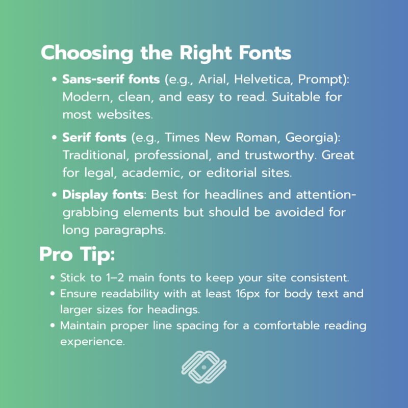
Fonts do more than display text — they define readability and the overall user experience (UX).
- Sans-serif fonts (e.g., Arial, Helvetica, Prompt): Modern, clean, and easy to read. Suitable for most websites.
- Serif fonts (e.g., Times New Roman, Georgia): Traditional, professional, and trustworthy. Great for legal, academic, or editorial sites.
- Display fonts: Best for headlines and attention-grabbing elements but should be avoided for long paragraphs.
Pro Tip:
- Stick to 1–2 main fonts to keep your site consistent.
- Ensure readability with at least 16px for body text and larger sizes for headings.
- Maintain proper line spacing for a comfortable reading experience.
Combining Colors and Fonts Effectively
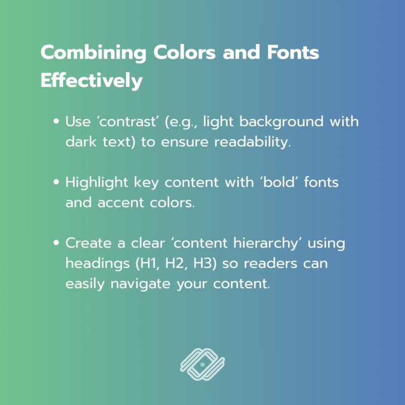
The synergy between colors and fonts creates a strong brand impression and guides user behavior.
- Use ‘contrast’ (e.g., light background with dark text) to ensure readability.
- Highlight key content with ‘bold’ fonts and accent colors.
- Create a clear ‘content hierarchy’ using headings (H1, H2, H3) so readers can easily navigate your content.
Web Design Tips to Attract Your Target Audience
- Research Your Audience – Understand who your users are and what style of colors and fonts resonates with them.
- Stay Consistent with Branding – Use a color palette and typography that reflect your brand identity.
- Ensure Responsiveness – Colors and fonts should look great on mobile, tablet, and desktop devices.
- Run A/B Testing – Experiment with different font styles or CTA colors to see what improves conversions.
Conclusion
Choosing the right ‘colors and font’ in web design is not just about aesthetics — it’s about communication and strategy. With the right combination, you can create a website that’s visually appealing, aligned with your brand identity, and highly engaging for your target audience. Done right, these design elements can boost ‘SEO performance’, increase user engagement, and turn visitors into loyal customers.
If you want your business to reach online customers and achieve sustainable marketing results, we are happy to provide consultation on what you need.
For further inquiries, contact us at:
Tel. 093 696 4498 Line OA: https://lin.ee/po8XduU
E-mail: mongkontep@pkindev.com
Inverze Solutions Co., Ltd. has received numerous awards for its achievements