Many people assume that a “premium-looking” website requires a large budget, a famous agency, or complex visual effects. In reality, the perception of luxury and professionalism doesn’t come from how much you spend — it comes from how well you manage the details.
Here are four essential design elements that can instantly elevate your website’s perceived value, even without increasing your budget.
- Typography — The Voice of Your Brand
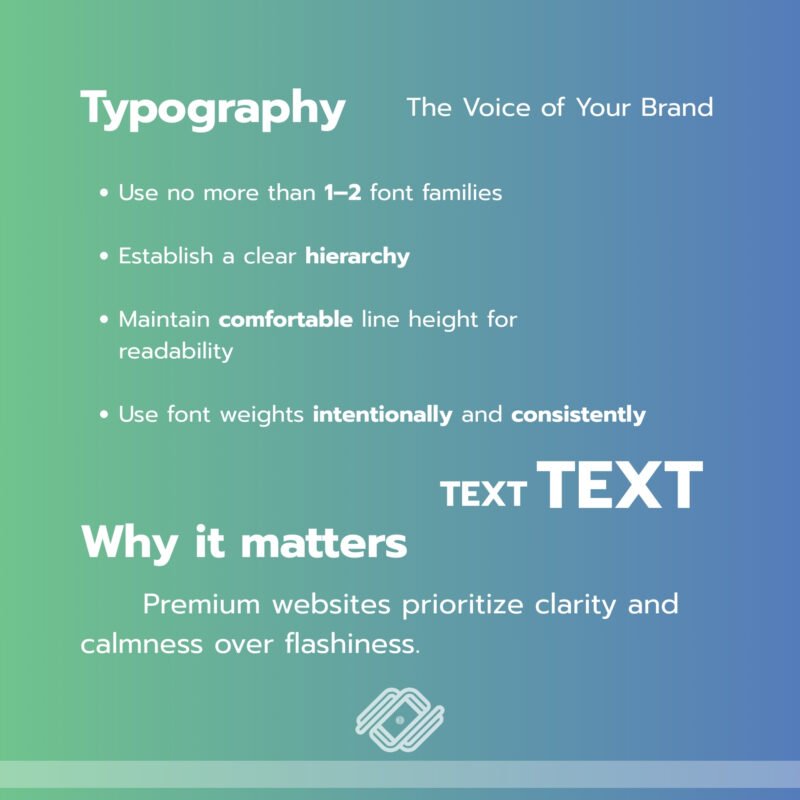
Typography is not just about choosing a beautiful font. It’s about building a clear and consistent typographic system.
What it should look like:
- Use no more than 1–2 font families
- Establish a clear hierarchy (H1, H2, body text, captions)
- Maintain comfortable line height for readability
- Use font weights intentionally and consistently
Why it matters:
Premium websites prioritize clarity and calmness over flashiness. Using too many fonts or inconsistent sizing immediately makes a website look amateur.
Good typography:
- Improves readability
- Communicates professionalism
- Builds trust in your content
In simple terms, typography is your brand’s voice. If the voice sounds refined, the entire website feels elevated.
- Color System — Luxury Comes from Control
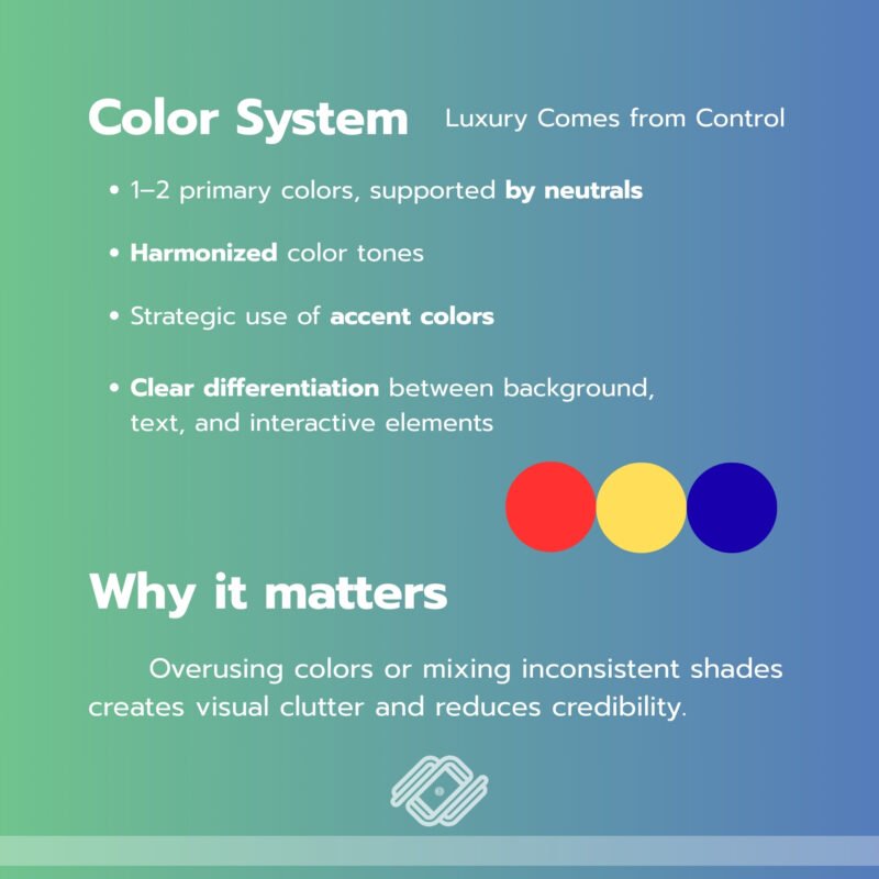
Premium websites don’t use more colors — they use fewer, but more intentionally.
What it should look like:
- 1–2 primary colors, supported by neutrals
- Harmonized color tones
- Strategic use of accent colors
- Clear differentiation between background, text, and interactive elements
Why it matters:
Overusing colors or mixing inconsistent shades creates visual clutter and reduces credibility.
Luxury brands often:
- Lean on neutral palettes
- Use generous white space
- Apply accent colors sparingly, especially for CTAs
A controlled color system reflects confidence. It shows that the brand doesn’t need to “shout” to stand out.
- Spacing — The Power of White Space
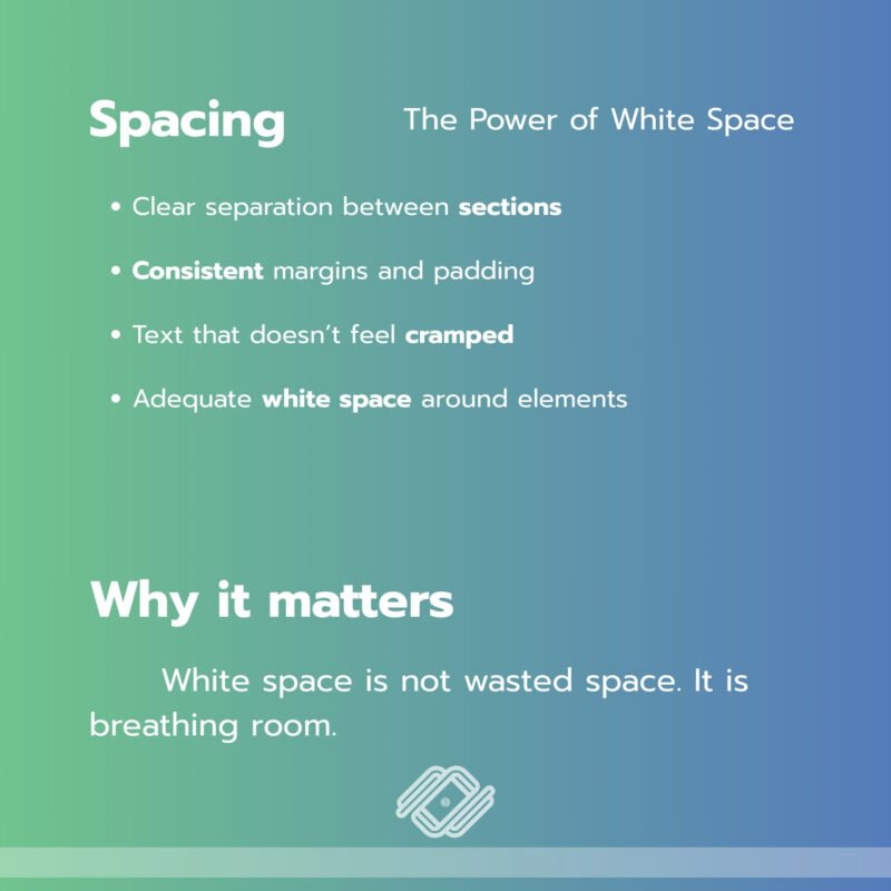
Spacing is one of the most overlooked elements in web design — yet it’s one of the strongest indicators of quality.
What it should look like:
- Clear separation between sections
- Consistent margins and padding
- Text that doesn’t feel cramped
- Adequate white space around elements
Why it matters:
White space is not wasted space. It is breathing room.
Low-quality websites often try to fit as much content as possible into one screen. Premium websites, on the other hand:
- Embrace negative space
- Allow each element to stand on its own
- Guide the user’s focus intentionally
Well-managed spacing makes a website feel:
- Cleaner
- More refined
- Easier to navigate
- Instantly more premium
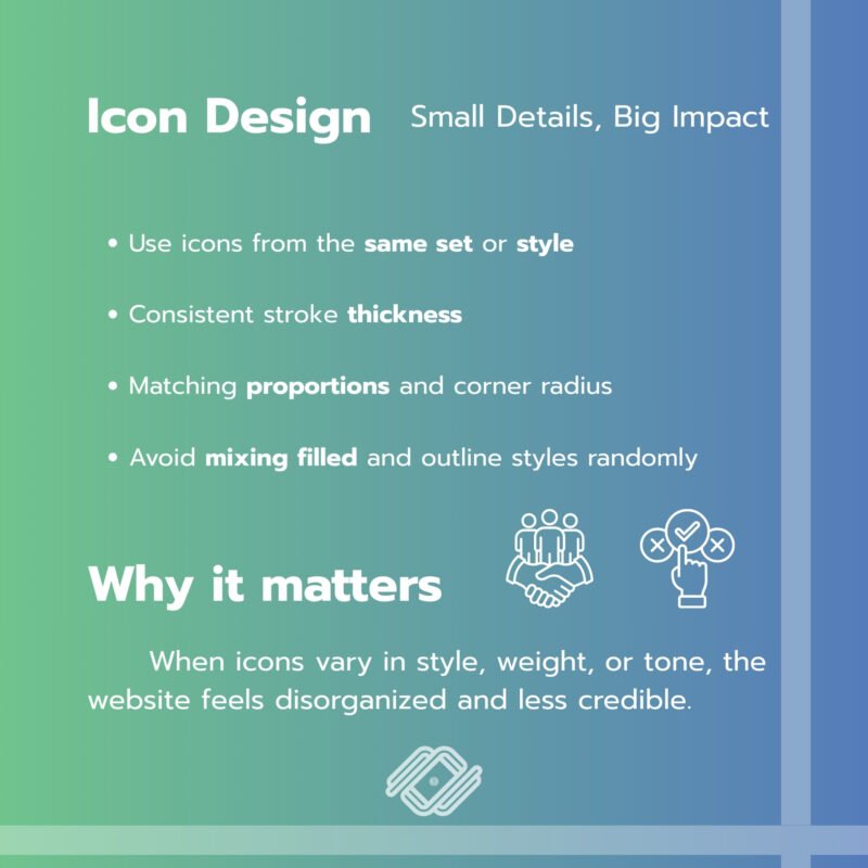
- Icon Design — Small Details, Big Impact
Icons may seem minor, but inconsistency here can instantly break the professional look of a website.
What it should look like:
- Use icons from the same set or style
- Consistent stroke thickness
- Matching proportions and corner radius
- Avoid mixing filled and outline styles randomly
Why it matters:
When icons vary in style, weight, or tone, the website feels disorganized and less credible.
When icons are consistent:
- The interface feels cohesive
- The brand appears detail-oriented
- The overall design looks more intentional
Premium design is often less about dramatic visuals — and more about precision.
Final Thoughts
A website looks expensive not because of heavy animations or extravagant visuals, but because of disciplined design fundamentals:
- A structured typography system
- A controlled color palette
- Thoughtful spacing
- Consistent iconography
When these four elements work together, your website becomes:
- Clean
- Trustworthy
- Confident
- And undeniably more premium
And the best part? You can achieve all of this without increasing your budget.
Source: talkatalka.com
If you want your business to reach online customers and achieve sustainable marketing results, we are happy to provide consultation on what you need.
For further inquiries, contact us at: Tel. 093 696 4498 Line OA: https://lin.ee/po8XduU E-mail: mongkontep@pkindev.com
Inverz Solutions Co., Ltd. has received numerous awards for its achievements