 ไทย
ไทย

Nowadays, speed and convenience are top priorities for people, and technology usage is no exception. Ease and quick responsiveness to user needs are crucial factors that technology developers must consider. Designing a website that is responsive to users, or ‘Responsive Web Design’, has become highly popular. The main goal is to “make it as easy as possible for users to interact with the site.”
Steps to Create a Responsive Web Design
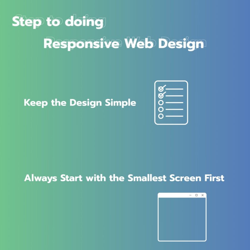
- Keep the Design Simple
- A website design should be as simple as possible. This includes writing HTML that contains only the necessary elements. However, designers should understand the specific business they’re creating the website for. If the business owner’s requirements differ from the designer’s understanding, it could lead to wasted time starting over.
- Always Start with the Smallest Screen First
- Begin by designing for the smallest screen (e.g., mobile phones). Most people tend to visualize a desktop layout first, but doing so can make coding more difficult and lead to redundant code.
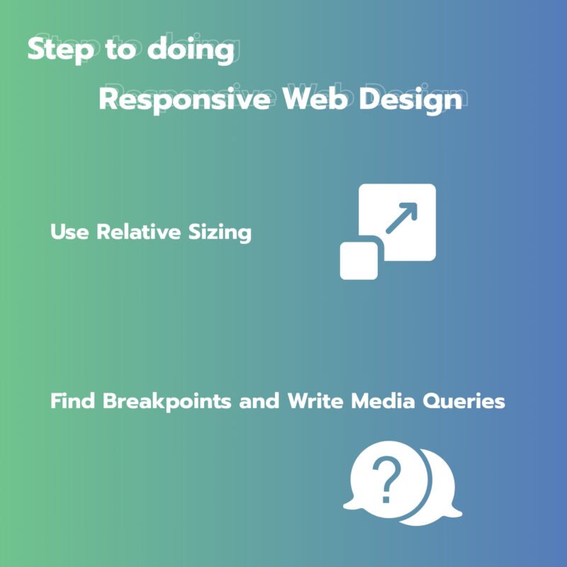
- Use Relative Sizing
- After creating the HTML, apply styles using CSS. You should ensure that the sizing of elements is relative to their surroundings. The first thing to define is the layout width using percentages rather than fixed pixels. Also, ensure images and fonts are sized in a way that maintains visual harmony across the site.
- Find Breakpoints and Write Media Queries
- Preview the website at around 300px width, aiming for the most user-friendly display. Gradually expand the viewport size until you find widths where layout adjustments are needed—these are your ‘breakpoints’. Use media queries to define CSS rules for each breakpoint to ensure the display adapts appropriately.
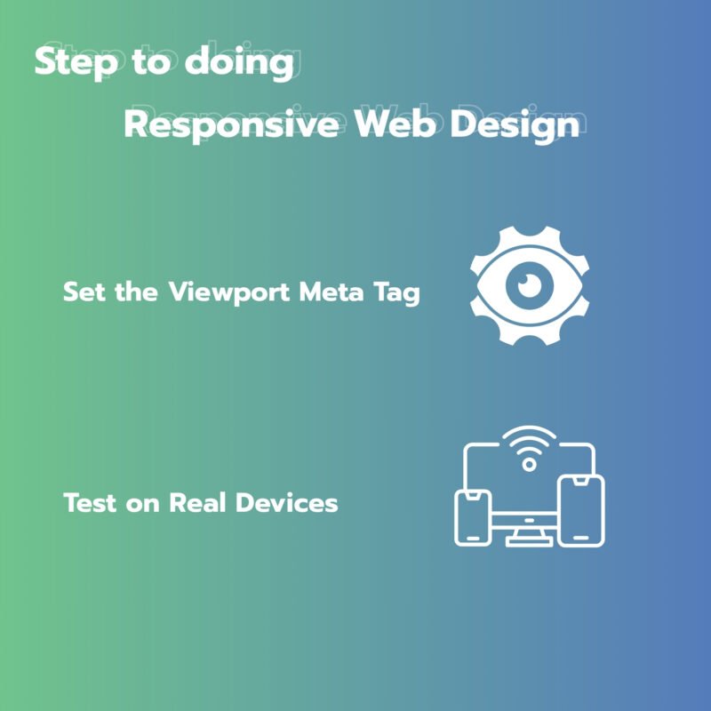
- Set the Viewport Meta Tag
- Use the viewport meta tag to set the default viewport settings.
- Test on Real Devices
- Test the website on actual devices. If you’ve planned carefully and followed each step precisely, your website will automatically look good across all devices.
In any case, for web designers, learning and understanding the desired outcomes is essential. Creating a good responsive website must start from the ground up. Thoughtful planning and design from the beginning are always better than fixing problems later.
Source: makewebeasy.com
If you want your business to reach online customers and achieve sustainable marketing results, we are happy to provide consultation on what you need.
For further inquiries, contact us at:
Tel. 093 696 4498 Line OA: https://lin.ee/po8XduU
E-mail: mongkontep@pkindev.com
Inverze Solutions Co., Ltd. has received numerous awards for its achievements